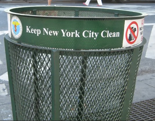
Mapping NYC’s 23K Trashcan Locations
example
gis
interactive
opendata
visualization
sf
tidyverse
mapbox-gl-js
mapboxer
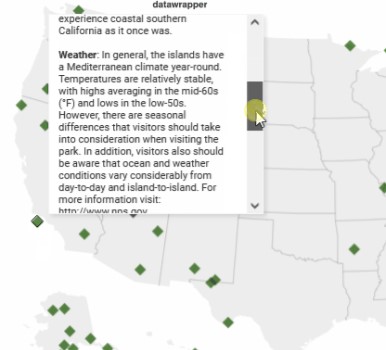
A Quick Look at Datawrapper’s Tooltips
datawrapper
gis
interactive
time-series
visualization
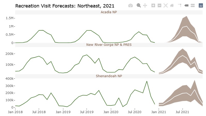
Forecasting National Park Visits
time-series
visualization
gis
example
crosstalk
forecast
sweep
usmap
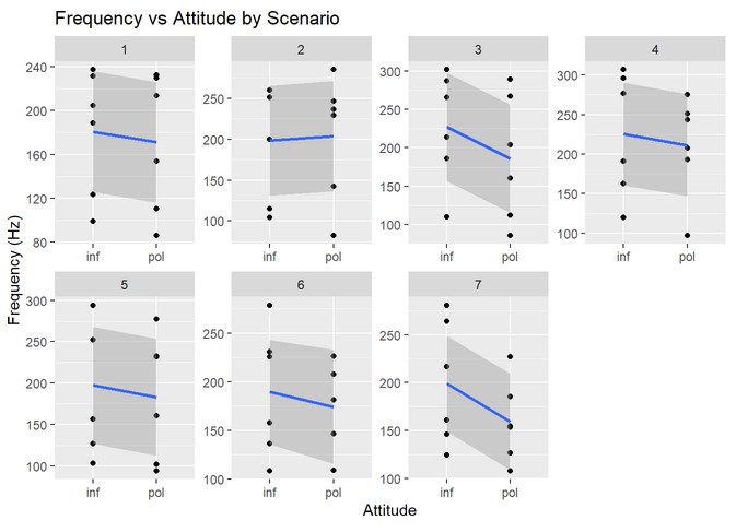
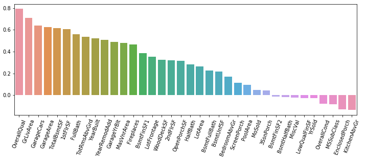
Basic EDA for Multilevel Data in R
eda
modeling
skimr
purrr
ggplot
example
package
StreetEasy Neighborhood Rentals & CrossTalk
eda
interactive
visualization
plotly
crosstalk
package
Translating Tract-Level ACS Data to NYPD Precincts
example
gis
opendata
sf
visualization
tidycensus
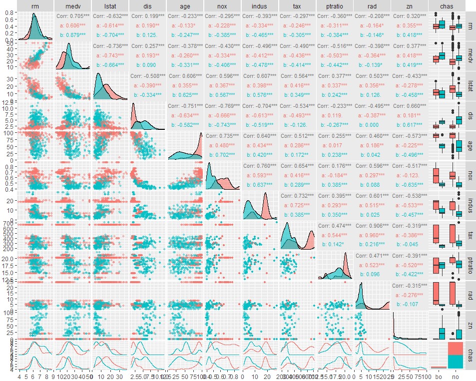
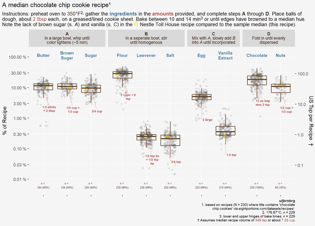
Binary Response and GGally
visualization
example
package
logistic regression
prediction
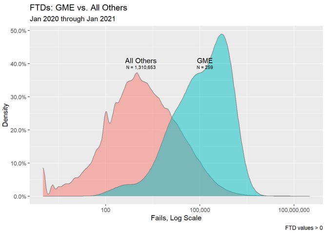
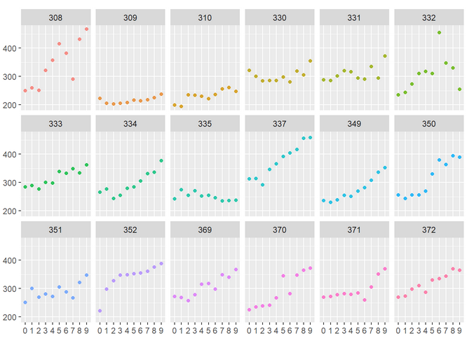
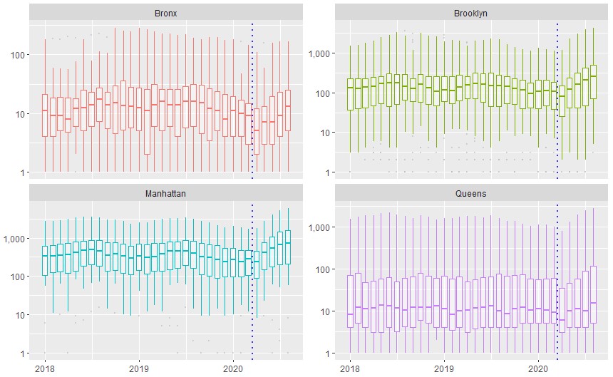
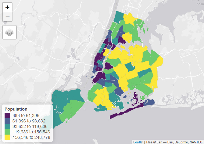
No matching items