I recently came across Datawrapper while checking out New York City’s COVID-19 Vaccines page and - going on appearance alone - the charts, tables, and maps (hosted & served by Datawrapper) appear attractive, responsive, and have a cohesive look.
As I am always interested in checking out new visualization tools, I took the Datawrapper API (and GUI) for a spin and created the below example as a proof of concept - you can hover-and-click on the map points to read additional information:
Tooltip Formatting
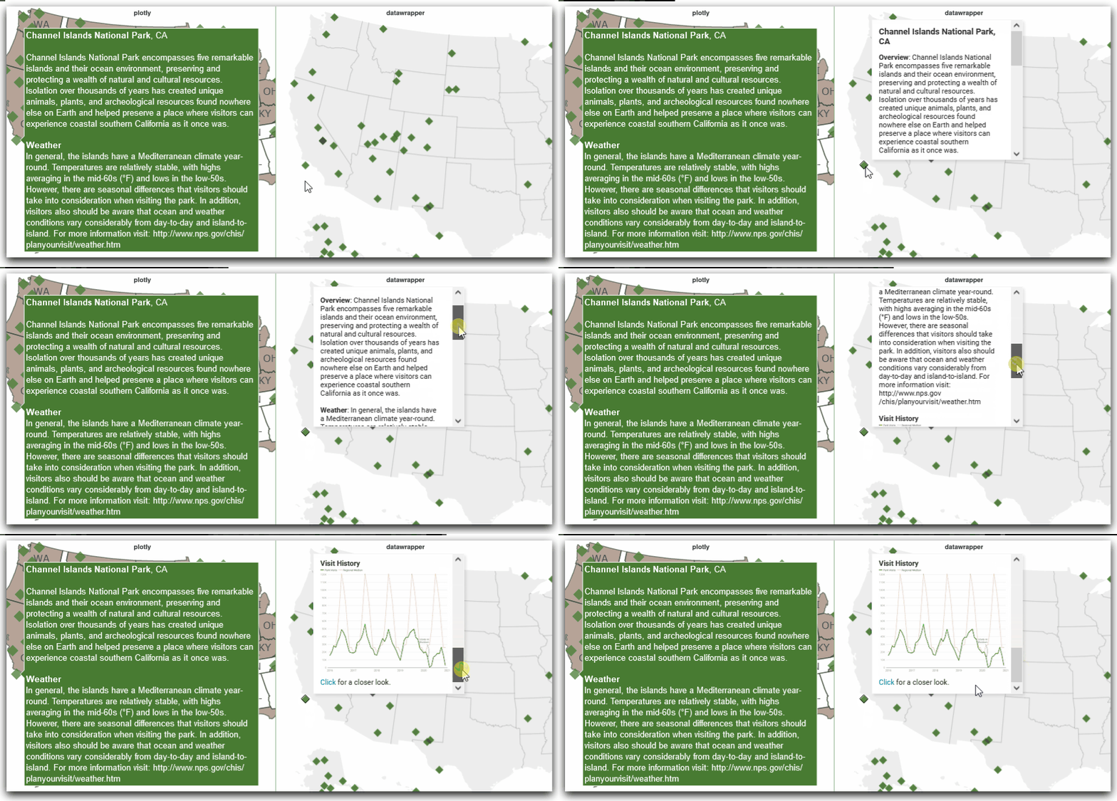
The points in the map above contain similar information to the plotly map at the bottom of my last post but I present it here as it’s a good demonstration of some of Datawrapper’s out-of-the-box features for tooltips on maps. Below I compare plotly (left) and Datawrapper (right):

Sure, these tooltips might be a bit information-dense overall and the visit-history thumbnails on my Datawrapper tooltips are too small to be effective, but for feature-demonstration purposes, they’ll do.
I see that Datawrapper tooltips provide word-wrap, support for displaying thumbnails, and scroll-bars for lengthy entries all without additional effort on my part. The result is a map that looks and feels professional and I’m here for it.
Focus on Aesthetics
I fully recognize that tooltip functionality is unlikely to be a deciding-factor for an organization that is looking for a new visualization tool. My goal in previewing these tooltips is that their features highlight Datawrapper’s primary value proposition: a focus on aesthetics.
For example, plotly’s charts might not look as good by default but their chart offering is currently much broader than Datawrapper’s and they provide the option to store and view visuals locally without sharing data. Tableau and other BI solutions can provide similarly formatted tooltips and a lot more features but a) you’ll need someone with design chops to make charts look as professional and b) you’ll pay much more than the cost of 10 annual Datawrapper licenses ($5,990/yr as of this posting) to make it happen.
What Else?
A lot, actually. Too much to delve into on a single post - I haven’t even covered all of the features of map tooltips, for example. As a teaser, here is one of the 63 visit-history plots that I created for the map using the Datawrapper API:
In short, if part of your job is producing presentation-worthy visuals, Datawrapper is worth a look - you can access their API in R with DatawRappr or Python with datawrapper or you can use their very-decent GUI.
References & Sources
- Datawrapper
- Datawrapper API Documentation
- Datawrapper GUI tutorial on using charts in tooltips
DatawRappr: an R package (whose name makes it difficult to search) allows for communication with Datawrapper’s API (Not on CRAN as of this posting - may require some fiddling, too)datawrapper- A Python library for accessing Datawrapper’s API- NPS Visitor Query Tool