A Median Chocolate Chip Cookie Recipe & Styling ggplot Text
Today’s post is a recipe for median chocolate chip cookies that’s also a ggplot chart with colored-coded text in the subtitle. The recipe is based on summary stats from 200+ recipes from eightportions.com’s “Recipe Box” data where the recipe title contains the text: “chocolate chip cookies” and the colored text was made possible with ggtext.
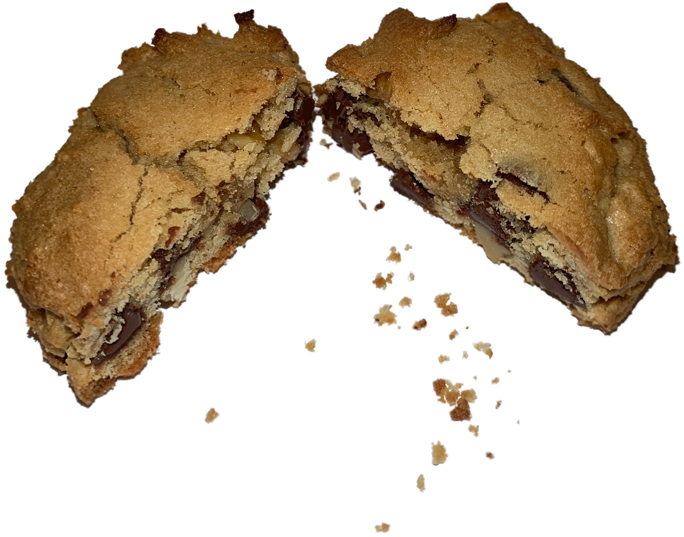
Tl;dr: The recipe:

I will briefly cover the source data, preparation, and one way to add colored text and unicode symbols ◍ to ggplot texts like caption, subtitle, title, etc. with help of ggtext.
Recipe Box Data
The original data came in a zip file containing three (3) .json files downloaded from eightportions.com. The files contain about 125K recipes from three different food websites. I then queried these for titles containing the text "chocolate chip cookies’ and used tidyjson to combine the results into a single data frame. The columns of the data frame include title and id along with named lists for ingredients and instructions. Here’s a preview of what it looks like:
## Rows: 230
## Columns: 4
## $ title        <chr> "Whole-Grain Chocolate Chip Cookies", "Chocolat~
## $ ingredients  <named list> <"1 1/4 cups all-purpose flour", "1 cup ~
## $ instructions <named list> "Combine the flours, wheat germ, baking ~
## $ id           <chr> "o.rcUMxY8gpETc6XU9EKrnDqGWFUB3i", "vv2lfdBzwfy~
Data preparation and clean-up relied heavily on regex to extract the mixed and proper fractions and convert them into numerical values. For example, here’s the regex pattern I used to extract the baking temperature from the instructions.
"\\d+\\b(?=(\\sdegrees|°F|°F.|°.))"As with most data projects, data cleanup and preparation took up the majority of the time. In this case I feel it yielded a pretty rich data set that’s got me interested in possible future work.

Styling ggplot Text
The ggtext library allows for the pass-through of markdown into just about any portion of ggplot that displays text. If you know how to add colored text to your markdown documents with html, adding colored text to your plot text follows the same path. See the package vignette for several examples on how to use it.
For example, one could add colored text, like this right here, to their markdown documents with a function that uses glue to insert values into an html chunk like this:
text_sc <- function(x, ptsz = "14", col = "#F2E750") {
  glue::glue("<span style ='color:{col};font-size:{ptsz}pt;'>{x}</span>")
}
Running the function like the following:
text_sc("TINY TEXT!", ptsz = "7", col = "#B84841")within the knitted markdown document results in this: TINY TEXT.
And coded in markdown, it even knits with unicode characters. It’s still a bit buggy with pasting unicode directly into the markdown but if you use the utf8 package, you can write your inline markdown by referencing the hex code for the unicode character you’re interested in. So, in-line code like this:
text_sc( utf8::as_utf8("\u25cd"), ptsz = "20")would look like this in the knitted output: ◍.
And you’re able to pass the the unicode symbol through ggtext and it will render the plot in Rstudio - note the yellow dot used to call out NTH in an alternate version of the recipe I created:

Unfortunately, knitting to html is limited and certain special characters are not supported - including the dot. Fortunately, you can still save the plot as .png and then post it as an image as I’ve done here, above. Note the first recipe plot - which was knitted to html for this post - uses an O to represent NTH in the subtitle because of said limitation.
Unicode in ggplot
Maybe you’re in a situation where you don’t need the features of ggtext but still would like to use a unicode symbol? That can work but your options will be limited to standard ggplot options. One option is to add the unicode symbol to your data argument as a column translated with utf8::as_utf8(). Another option is to add unicode directly into ggplot arguments, as I do for shape and axis.title.x in the simple example below:
crown <- utf8::as_utf8("\u265a") # ♚
mtcars %>%
  ggplot(aes(wt, mpg)) +
  geom_point(shape = crown, size = 10, alpha = .5) +
  labs(title = "adding styled unicode to x-axis title",
       x = glue("{crown}")) +
  theme(axis.title.x = element_text(size = 30, color = "red"))
But remember, without ggtext, you’ll be limited to one color per text field.
Despite the knitting-to-html limitation, ggtext makes it possible to easily adjust the styling of the text feeding into your ggplot. If you must knit to html, adding unicode to standard ggplots is straight-forward using utf8. These styling options open up a wide-variety plot enhancements from replacing your plot’s legend to color-coding and styling your axis text for improved clarity or information density.
That concludes today’s post! It’s been almost a year since the start of the pandemic and with cases dropping and vaccine distribution increasing, I’m feeling hopeful for the summer. While you wait to get your vaccine, why not bake a batch of median chocolate chip cookies? - they are not half bad (intentional pun and accurate description).