StreetEasy Neighborhood Rentals & CrossTalk
At this point it’s pretty well-established that the pandemic has had a tremendous impact on human life around the world and particularly within New York City’s five boroughs. At the time of this post, over 10% of the USA’s 209K+ deaths have come from NYC alone (23,852).
The death-toll from the pandemic is staggering on its own - and continues to shock in its reach - but the addition of the shutdown (and continued restrictions - even in Phase 4 of the reopening) has had a compounding effect on all aspects of socioeconomic activity in the city.
Many companies with NYC office space have been switching over to full-time remote staff and have extended work from home through summer 2021 - among them Indeed, Google, and at least 18 others. With so many people working from home, public transportation usage is at a record low - particularly subway ridership.
Stories of a "pandemic exodous" abound for a time - claiming folks are moving away from the tri-state area in droves (some suggest the story was exaggerated - at least at the time but if you’re a resident of NYC like me, you might prefer this take on the so-called “exodus”).
StreetEasy’s Rental Data
Opinions aside, the long-and-short of it is that the city has some grim challenges ahead. In avoiding the stresses of the pandemic - now common in 2020 - I decided to make today’s post about StreetEasy’s all-rental data to see if the data shows any indication that the pandemic has impacted apartment rentals since the beginning of the shutdown (March 17th, 2020).
Near the end of the post, I’ll preview R’s crosstalk package - it works with ggplot and plotly so be sure to have those installed if you’re going to try it out (skip straight to the crosstalk preview here.)
Overview
StreetEasy (owned by Zillow) is well-known to anyone who’s been NYC apartment-hunting in the past 10 years and even more-so for folks searching in the past 5 years. They’ve posted close to half a million rental listings on an annual basis since 2015.
Contents
After downloading the All.zip file, unzipping, and then unzipping the included files discountShare_All.zip, medianAskingRent_All.zip, and rentalInventory_all.zip, combining and converting into tidy format in a tibble called df, the data will look like this:
glimpse(df)## Rows: 76,032
## Columns: 6
## $ areaName <chr> "All Downtown", "All Downtown", "All Downtown", "All Midtow~
## $ Borough <chr> "Manhattan", "Manhattan", "Manhattan", "Manhattan", "Manhat~
## $ areaType <chr> "submarket", "submarket", "submarket", "submarket", "submar~
## $ setname <chr> "Discount Share", "Median Asking Rent", "Rental Inventory",~
## $ yyyymm <date> 2010-01-01, 2010-01-01, 2010-01-01, 2010-01-01, 2010-01-01~
## $ value <dbl> 0.114, 3200.000, 4268.000, 0.106, 2875.000, 3065.000, 0.135~The data contains several features and a time-frame starting in 2010 but today’s post is going to focus on a subset of the data, plot_dat, with the follow criteria:
areaType == 'neighborhood': Just the neighborhood names (to exclude borough-level counts)yyyymm >= 2018: Listings later than and including 2018 through August 2020setname %in% c("Rental Inventory", "Median Asking Rent", "Discount Share")
Before making any assumptions about the following plots, please review the data consideratons under the reference section at the end of this post.
Rental Inventory by Month
The number of rental listings available on StreetEasy across all neighborhoods, monthly since 2018, by NYC borough.
rental_plot <- plot_dat %>%
  filter(setname == "Rental Inventory") %>%
  ggplot(aes(x = yyyymm, y = value,
             group = yyyymm))+
  geom_boxplot(aes(color=Borough),
               alpha = .4,
               outlier.color = "gray",
               outlier.alpha = .50,
               outlier.size = .5)+
  geom_vline(xintercept = as.Date("2020-03-17"),
             linetype = 3,
             alpha = .8,
             color = "blue",
             size = .75) +
  scale_y_log10(labels=scales::label_comma(accuracy = 1))+
  facet_wrap(~Borough, scales = "free_y")+
  my_theme

rental_plot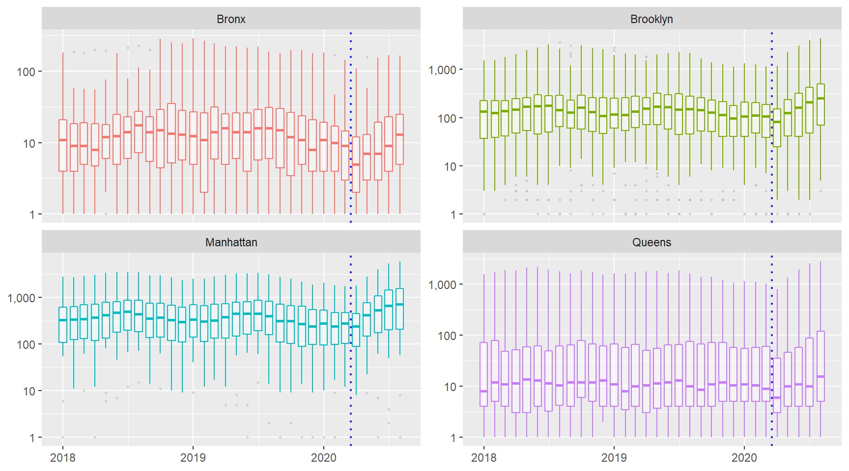
Each box plot represents a month and the value range is across all neighborhood listings for that month and the vertical, blue-dotted line indicates the beginning of NYC’s official shutdown, March 17th, 2020.
In each borough, there appears to be an increase in the median number of listings posted. Both Brooklyn and Manhattan neighborhoods appear to be flattening but Queens neighborhoods are still showing growth as of the data available at posting, through August 2020.
Median Asking Rent
The plot code remains the same except I filter setname on "Median Asking Rent", and I focus on values strictly greater than $50 per month. Further, I introduce plotly’s ggplotly function and convert the median rent plot, medrent_plot, into an interactive plot:
ggplotly(medrent_plot, dynamicTicks = TRUE) Median rents seem to be dropping in Brooklyn, Manhattan, and Queens neighborhoods. I am less clear on the impact to the Bronx.
On a technical note, being able to zoom-in on the plot with plotly to see the actual values extends and improves the usability of this plot. I wish the formatting was just a little closer to standard ggplot, however.
Discount Share
The share of all active rental listings on StreetEasy that had a reduction in asking rent during that month across all neighborhoods. I filter like previously except I set setname on "Discount Share", and I focus on values strictly greater than 0.1% per month:
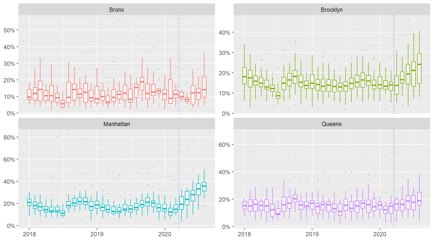
The rise in Discount Share after the shutdown is most-prominent in Manhattan and Brooklyn neighborhoods - this aligns with my previous observations in the Inventory and Median Asking Rent plots. I was bit surprised about how tightly packed the middle 50% of the Manhattan values remained month-to-month prior to the shutdown, too.
On a technical note, for pure exploration, like when I’m first looking into a new data set, I prefer the standard, out-of-the-box ggplot plots over the output from ggplotly.
Crosstalk
The element of interactivity can open up a variety of chart options that would not be appropriate for a static plot. While plotly is the current standard for converting a ggplot into an interactive plot via the ggplotly function, being able to turn your plot into a mini-dashboard could offer even more power: enter crosstalk.
In short, crosstalk enhances plotly plots through the use of a shared data object that allows for shiny-like linked-action interactivity. With crosstalk & plotly , one can manipulate the data feeding a plot entirely within the client-side in a web browser - i.e. there is no need for a supporting web server or callback to function!
Let’s try it out!
Prep Data
First I create a data set called ddf that is filtered as described in the Contents and add hover-over label column called text:
ddf <- df %>%
  filter(areaType == "neighborhood", value > 0, yyyy >= 2018) %>%
  mutate(value_preso = ifelse(
    grepl("disc", tolower(setname)), scales::percent(round(value, 4)),
    ifelse(grepl("media", tolower(setname)),
           glue("${scales::comma(value)}"),
           ifelse(grepl("inven", tolower(setname)),
                  scales::comma(value), ""))
    ),
    text = glue("{setname},<br><b>{areaName}</b>:
                <b>{value_preso}</b>
                {as.character(yyyy)}-{as.character(mm)}"),
    setname = as.factor(setname))

ddf$setname <- fct_relevel(ddf$setname,
                           levels = c("Rental Inventory",
                                      "Median Asking Rent",
"Discount Share"))glimpse(ddf)## Rows: 12,777
## Columns: 10
## $ areaName <chr> "Astoria", "Astoria", "Astoria", "Auburndale", "Auburnda~
## $ Borough <chr> "Queens", "Queens", "Queens", "Queens", "Queens", "Brook~
## $ areaType <chr> "neighborhood", "neighborhood", "neighborhood", "neighbo~
## $ setname <fct> Discount Share, Median Asking Rent, Rental Inventory, Me~
## $ yyyymm <date> 2018-01-01, 2018-01-01, 2018-01-01, 2018-01-01, 2018-01~
## $ value <dbl> 0.197, 2150.000, 1560.000, 2300.000, 17.000, 0.088, 1875~
## $ yyyy <chr> "2018", "2018", "2018", "2018", "2018", "2018", "2018", ~
## $ mm <dbl> 1, 1, 1, 1, 1, 1, 1, 1, 1, 1, 1, 1, 1, 1, 1, 1, 1, 1, 1,~
## $ value_preso <chr> "19.700%", "$2,150.00000", "1,560.00000", "$2,300.00000"~
## $ text <glue> "Discount Share,<br><b>Astoria</b>:\n<b>19.700%</b>\n20~Create highlight_key
Next I convert the ddf into a highlight_key that will then be transformed into a shared data object. See the comments in the code chunk below for additional context:
ddf_plot <- ddf %>%
  # set shared data key to `areaName`, ask user to select
  # note the open brace after the pipe:
  highlight_key(~areaName, "Select a Neighborhood")  %>% {
  # the facet_wrap is baked inside the highlight_key:
  ggplot(., aes(x = yyyymm, y = value, group = areaName,
                color = Borough, text = text))+
  geom_line(alpha = .5)+
  facet_wrap(~setname, scales = "free_y", nrow = 3)+
  theme(legend.position = "none",
        axis.title.x = element_blank(),
        axis.title.y = element_blank())
  } %>%
  # convert the ggplot into a ggplotly object &
  # add in the crosstalk element `hightlight()`
  ggplotly(dynamicTicks = T, tooltip = "text") %>%
  highlight(dynamic = TRUE,
            selectize = TRUE,
            selected = attrs_selected(opacity = .8,
                                      size = 3)) %>%
  layout(showlegend = FALSE)
Hold the SHIFT key to select more than one neighborhood at a time (trace or dropdown) and also note the ability to switch brush colors between selections:
ddf_plotUsing crosstalk is relatively straight-forward if you’re already familiar with plotly but it can seem finicky to plotly newbs. My reccommendation is to get a solid foundation with plotly and perhaps try working with shiny to understand the shared data object before diving into crosstalk.
Closing
Unfortunatley, I do not think that we’re near seeing the end of the socioeconomic impact of the pandemic but as the world awaits a vaccine, you can take your mind off things by actively chasing down joy. Joy, in turn, supports hope. One of the things that brings me joy is diving into a new dataset and learning some new tools - why not try it out for yourself?
Reference
Links and Sources
Data Considerations
While StreetEasy’s data is probably a decent source of information on the current state of NYC’s apartment rental market - it is popular, regularly refreshed, and contains thousands of listings - it does come with limitations that mean it cannot tell the whole story. Here are some points of consideration:
- Staten Island is not included in StreetEasy listings.
- Bronx listings appear underrepresented in the data across all years (since 2010) with rarely over a 1,000 listings in a month. Whether this is a function of unpopularity of the site to Bronx landlords, lower economic mobility of residents, high-demand, or a combination of several factors is unknown.
- There exists several alternative resources to find apartments in NYC - no site will have access to all available rental listings.
- Anyone who’s ever apartment-hunted in NYC can tell you that neighborhood boundaries can be stretched to the point of meaninglessness by marketers. E.g. An apartment on the “Upper West Side” according to the listing may actually be located in what may be better-known as Morningside Heights, Washington Heights, or Harlem.
StreetEasy Definitions
- Discount Share: The share of all active rental listings on StreetEasy that had a reduction in asking rent during that month/quarter/year.
- Median Asking Rent: The exact middle asking rent among all rental listings available on StreetEasy at any point during the month/quarter/year. In general, median values are more accurate than average values, which may be skewed by price outliers (a few rentals that are extremely expensive or extremely inexpensive).
- Rental Inventory: The number of rental listings available on StreetEasy at any point during the month/quarter/year.
Neighborhood Map
This doesn’t show all the neighborhood names but it’s a good reference for those that may not be familiar with any:
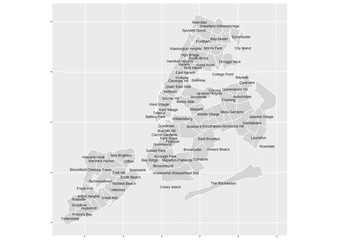
StreetEasy/Zillow used to share their neighborhood shape files but it seems like they’ve since stopped as this link now directs you to a contact form. I picked up this shape file from this website but I cannot vouch for its authenticity. I know that it must be at least a bit older because a few of the more-modern NYC neighborhoods aren’t mentioned (e.g.DUMBO).