Plotly Scattermapbox with R and Python
I recently tried out plot.ly’s open source graphing library and found it to be challenging but worth the effort. Challenging, in that the documentation has some gaps but worth it in that the features of the standard plots are responsive (via .js) and feature-rich right out of the box.
I tried out both python and R versions of plot.ly and I found the R version to be the most straight-forward to use and deploy via shinyapps.io. You can also make and deploy plotly web-app with python using their Dash framework that you can deploy/host on Heroku. `
The documentation is great for both languages but if you’re going the R route, I highly recommend this post (by the dude who’s writing a plotly book for R. It works very well if you’re familiar with the tidyverse, too.
For the python route, you may want to join the plotly forum if the documentation doesn’t cover your particular visualization needs. I found the community responsive and patient.
Python Route
For the python version, the goal was simple: make a scattermapbox with two colors identifying the respective boroughs in my NYC EMS data. The below code will run but you will need to sign up for a mapbox_access_token here.
import pandas as pd
import plotly.plotly as py
import plotly.graph_objs as go

mapbox_access_token = 'your_mapbox_token'              # www.mapbox.com/
df = pd.DataFrame(
    {"BOROUGH": ['MANHATTAN','MANHATTAN','MANHATTAN',
                 'QUEENS', 'QUEENS', 'QUEENS'],
     "CALL_QTY":[100, 10, 5, 15, 30, 45],
     "lat":[40.75, 40.72, 40.73, 40.72, 70.71, 40.721],
     "lng":[-73.99, -73.98, -70.97, -73.74, -73.73, -73.72]})

u_sel = [list(a) for a in zip(['MANHATTAN', 'QUEENS'], # names
                              ['blue', 'orange'],      # colors
                              [0.6, 0.7])]             # opacity

def scattermap_data(df, u_sel):
    """Outputs a list scattermapbox traces on BOROUGH"""
    return([go.Scattermapbox(
        lat = df.loc[df['BOROUGH']==b].lat.astype('object'),
        lon = df.loc[df['BOROUGH']==b].lng.astype('object'),
        mode = 'markers',
        marker = dict(
            size=df.loc[df['BOROUGH']==b].CALL_QTY,
            sizeref=0.9,
            sizemode='area',
            color=color,
            opacity=opacity
        )
    ) for b, color, opacity in u_sel]
    )

data = scattermap_data(df, u_sel)
layout = go.Layout(autosize=False,
                   mapbox= dict(
                       accesstoken=mapbox_access_token,
                       zoom=10,
                       style = 'dark',
                       center= dict(
                           lat=40.721319,
                           lon=-73.987130)
                   ),
                   title = "Two Distinct Traces on Scatter Mapbox")
fig = dict(data=data, layout=layout)
py.plot(fig, filename='tmapbox')                     # post to plotly
And here’s the plot that’s been stored and served from my plot.ly account:
R Route
For the R version of the plot, I ran the below in the console of an R Studio session (note you’ll have to add your mapbox token to the environment for the map to work). RStudio doesn’t display the maps in-session at this time but you can select to view in new window from the Viewer pane.
library(tidyverse)
library(plotly)
dfff <- data_frame(borough = c('MANHATTAN','MANHATTAN','MANHATTAN',
                               'QUEENS', 'QUEENS', 'QUEENS'),
                   call_qty = c(100, 10, 5, 15, 30, 45),
                   lat = c(40.75, 40.72, 40.73,
                           40.72, 70.71, 40.721),
                   lon = c(-73.99, -73.98, -70.97,
                           -73.74, -73.73, -73.72)
                   )

p <- dfff %>%
  plot_mapbox(lat = ~lat, lon = ~lon,
              #split = ~BOROUGH,
              color = ~borough,
              mode = "markers",
              size = ~call_qty,
              marker = list(sizeref = 1.5,
                            sizemode = "diameter",
                            opacity = 0.5)
              ) %>%
  layout(mapbox = list(style = 'light',
                       zoom = 9,
                       center = list(lat = ~median(lat),
                                     lon = ~median(lon))),
         legend = list(orientation = 'h',
                       font = list(size = 8)),
         margin = list(l = 10, r = 10,
                       b = 5, t = 10,
                       pad = 2)
         )
p
Here’s a screen capture of the map.
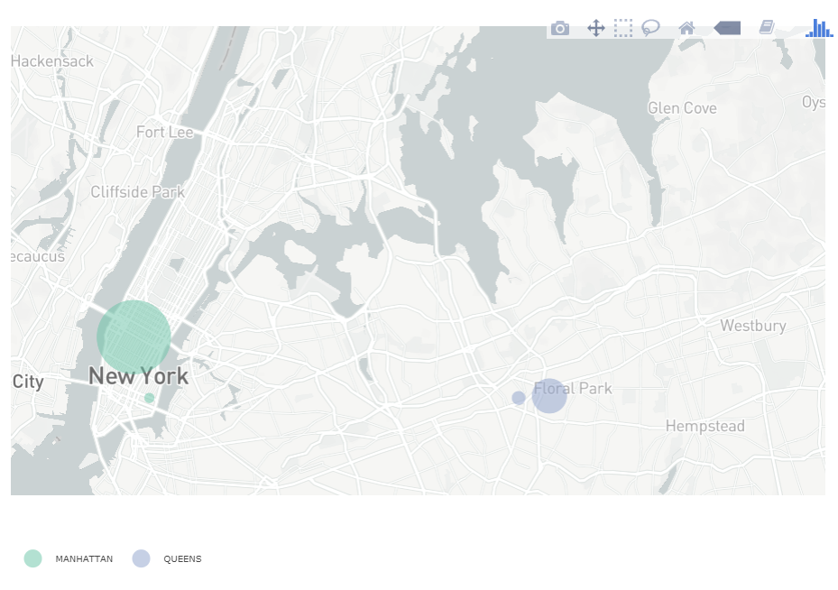
Screen capture of R version of scattermapbox
The JavaScript flavor, which forms the basis for the python and R versions, has been around longer and has an audience to match. I’m only recently getting into .js but the flexibility of being able to plot in any .html page is attractive. Having a little bit of html knowledge before diving in would be helpful here.